Against All Odds: Athenian Lady
This banner is an Equine Portrait of the Breyerfest 2024 Celebration Horse, Athenian Lady. The theme of the festival this year is “Against All Odds.”
Athena was found by her owner, Amanda Delgado, in an emaciated state living in a pasture accompanied by the skeletons of other horses and rusted out vehicles.
Delgado named her after the Greek goddess of war, both being elegant and resilient. Through trials of gaining trust, recovering of injury, the duo began showing at local shows and now compete in Western Dressage at World Championship levels.
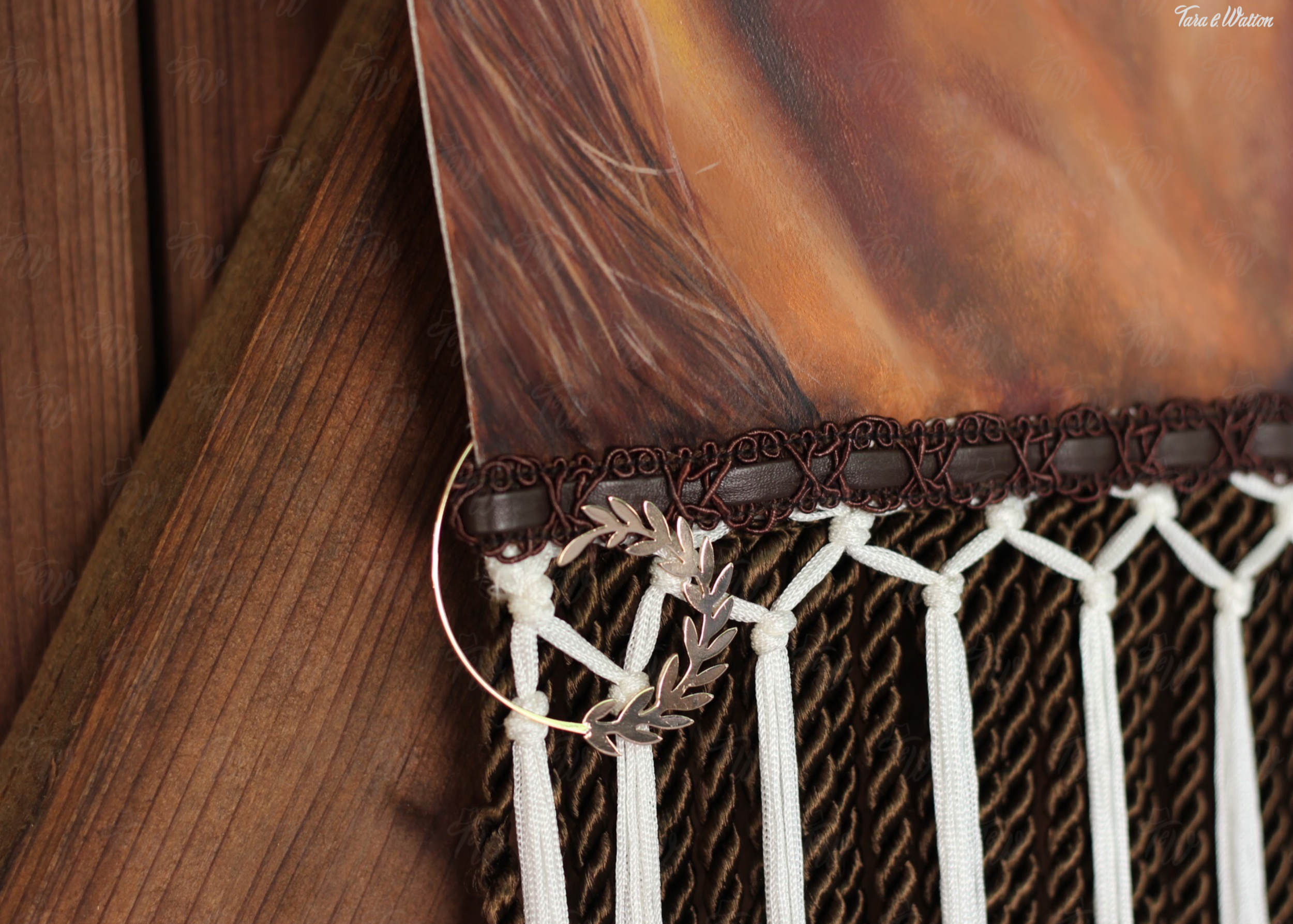
I couldn’t imagine a better suited horse to represent as the Celebrated Horse for Breyerfest of 2024. I immediately had the urge to paint this gorgeous lady using acrylic paint on white crepeback satin, dressed with chocolate and white latticed fringe, along with chocolate and leather trim. Adding finishing touches of gold tassels with rope, rose gold metal fixtures and a silver concho to pay homage to her sport.
Between “Athenian” and “Lady” you will find where the two words of her name connect, an infinity symbol, symbolizing their bond lasting forever.
Equine Sash
This is a sash is measured & designed to fit a horse.
“Veni, Vidi, Vici” is Latin meaning “I came, I saw, I conquered.” I felt that this is a fitting quote to suit a horse and rider whom have conquered the riding ring.
I did not want to use the traditional blue, red, yellow colors that are typically used to decorate first place winners of a show ring. I wanted my victor to be dressed differently. Using a blush pink satin, red and gold ochre accents, and sheer ribbon that glistens in the light. Tan & red Victorian typeface, along with a vintage brass medallion within the center of the ribbon displaying an angel with horses.
All brought together by adjustable Velcro to be sizeable to the horse to wear this sash with pride.
Kitty Walton’s Apple Pie Moonshine
This is a banner advertising a product of Walton’s Distillery Inc., miss Kitty Walton’s Apple Pie Moonshine.
One of the many benefits to having a distillery in the family, is having an array of colorful products to represent in the form of fancy schmancy banners.
When I think of apples, and great great grann-relatives, I think of a rich dusty red almost velvet-like satin, thick deep red trim, and wispy light pink fringe that floats in a breeze. Reminiscent of vintage apples from my family tree.
Miss Kitty is painted in a posterized style with a color palette of reds, pinks & tans. Of course we can’t have Great Great Grandma Kitty without her holding her infamous apple pie to which she has a moonshine named after.
Walton’s Distillery Inc. has a style of mixed typefaces, so I felt I had design-freedom with ignoring the “no more than three different typefaces” rule. Nonetheless, I had fun mixing & matching these all very bold typefaces, especially the circus-styled typeface for “moonshine.”
Lights Camera Fashion
This is a banner advertising an annual fashion show, Lights Camera Fashion. Produced by Jenna Hamilton from My Best Friend Jenna boutique, located in Jackson, TN, and featuring fashion designs by Johnathan Kayne, based in Nashville, TN.
This fashion show is a show built upon helping those in need, in which all proceeds are donated to St. Jude Children’s Research Hospital.
I have had the opportunity to volunteer for this event over the years, taking part both out on the floor with the lovely people who make donations, and behind the curtain with the young girls that work hard to help raise funds for such a generous cause.
This annual event has become quite the family collaboration. Jenna’s sisters are always committed to help wherever they can, her father, being the horseman & showman he is, always brings a well-mannered trick horse to add a special southern flair to the show, not to mention many other members of her family & life-long friends take this event to their hearts.
I went for a classy chic look in traditional black satin, with silver accents, black & silver lacing, black fringe, and a flowy black chiffon cape in admiration of the flowy gowns that are designed for the show. The logos of the boutique, LCF fashion show, designer Johnathan Kayne, & St. Jude Children’s Research Hospital are painted in bright silver, accenting the trim.
Sequoia National Park
This is a banner representing Sequoia National Park.
I’ve always admired posters like those from Anderson Design Group, that showcase national parks, cities, or any location that some of which I have never heard of or been to. There’s something about those posters that display one “shot” of the landscape and/or display a few elements significant to that area that associate with that place, which makes you relate to the location.
When I think of Sequoia National Park, I think of towering Redwood trees, that make you realize how small you truly are, blooming and ever-growing nature, and that traveler that does so in a stylish bug - which makes you want to punch your sibling on the arm and yell “PUNCH BUGGY!”
Highlighting the yellow blooms & buggy, is a golden border with gold fringe accompanied by a vintage typeface in gold. Paying homage to traditional travel posters of the past, and showcasing how the past can be nostalgic & completely stylish in the now.
Banner Series
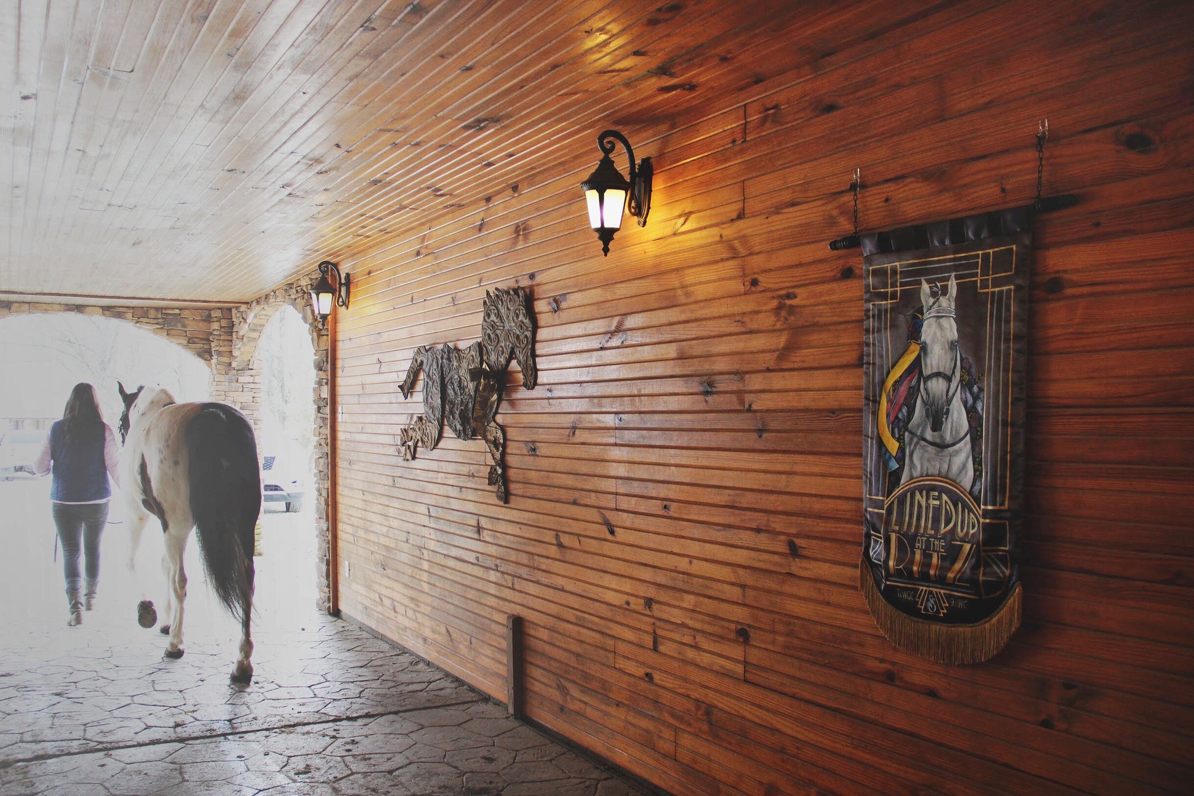
These three banners are among the first banners I ever made, during an independent study overseen by my mentor, Shelby Rodeffer. I chose to create banners that advertise and reflect show horses from the ranch where I ride.
This was a fun introduction into banner-making for me, and I ended up being awarded Best In Show at the art exhibition, Split & Twisted, October 2019, at Watkins College of Art in Nashville, TN.


